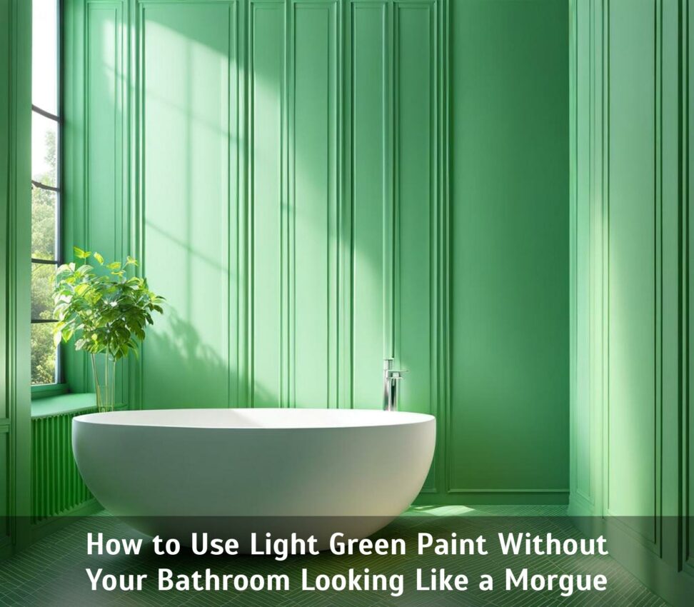
How to Use Light Green Paint Without Your Bathroom Looking Like a Morgue
Light green may seem like a fresh choice to liven up your boring white bathroom. But be warned - it can go horribly wrong. One misstep and your bright, airy oasis transforms into a cadaver-like dungeon no one wants to enter. We've all seen the chilling photos.
However, when used correctly, light greens can inject vigor and tranquility into tired bathrooms. The key is understanding how to leverage its unique qualities. With considerations around undertone, lighting, color coordination, and sheen, you can avoid the dreaded morgue effect.

Choose the Right Undertones
Not all light greens are created equal. Paint undertones play a major role in the overall look and feel of the color. Essentially, undertone refers to the hints of color that come through based on the primary pigments used.
There are a few main categories:
- Warm undertones like yellow, red, orange
- Cool undertones like blue, green, purple
- Neutral undertones with a balanced mix
Why does this matter? Because undertones interact with light uniquely. Cooler greens may take on a clinical appearance under bright bathroom bulbs and natural light. Warmer olive greens can start resembling swamp water.
Case Study: Sherwin Williams Sea Salt
A popular bathroom choice is Sherwin Williams Sea Salt, a pale gray-green. With its slightly cool undertone, this shade must be used strategically to prevent seeming medicinal. Combining it with warm wood cabinets and a touch of blue padding on chairs warms the space.
Case Study: Benjamin Moore Pistachio
On the flip side, Benjamin Moore Light Pistachio has warm yellow-green undertones. While cheery, going overboard into full-on neon bright green is a danger. Using matte finishes and layering in some grounded neutral textures prevents this.
When selecting a light green, assess its undertones under different lighting. Pay attention to how much yellow, blue, gray comes through. This will guide appropriate coordination.
Layer the Lighting
Bathroom lighting can make or break a paint choice. Dark shadows in the wrong spots, overexposed bulbs, intense spotlights all wreak havoc. Instead, thoughtfully layer lighting for dimension and flexibility.
Start with natural light. Windows and skylights allow sunshine to illuminate colors genuinely. Then build out artificial layers with overhead ceiling fixtures, dangling pendants, vanity strips, and sconces. Install dimmers to control brightness. Vary the angle, location, and temperature of bulbs to produce both focused task lighting and soft, diffuse ambient glows.
Case Study: Recessed Spotlights
Consider using multiple recessed downlights pointed in different directions. Position intense bulbs over the shower and sink for tasks. Install warmer, dimmable fixtures above the tub for relaxing. Add a translucent window to filter harsh midday rays. The lighting layers work in harmony to showcase light green's nuances.
Pick Complementary Colors
Color theory explains how colors interact with and influence each other. Complementary colors - those opposite on the color wheel - intensify one another when paired. The right complements can make a light green pop.
Shades like aqua, violet, yellow, and blue-green are vibrant complements. Bolder versions give the space energy; softer tones create serenity. Don't overlook neutral complements like white, beige, gray, and brown. Crisp contrasts add definition.
Case Study: Behr Celery Ice and Navy
The yellow-green hue Behr Celery Ice has a bright, lively effect. Pairing it with rich navy blue accessories and towels intensifies both colors. The dark navy also grounds the scheme with contrast and weight for balance. Crisp white trim keeps it fresh.
Contrast Glossy and Matte Finishes
Another dimension impacting color is sheen - essentially, the glossiness of a surface. Glossy, shiny finishes reflect light differently than flat, matte ones. Strategic use of glossy and matte sheens can spotlight a light green dramatically.
Imagine glossy jadeite glass tiles defining the sink wall and sleek lacquered cabinets. Adjacent matte painted walls recede while saturated green glass and cabinetry become focal points. The dimensional contrast showcases the colors.
Case Study: Glossy Tile and Flat Ceiling
To create depth, consider glossy penny round mosaic tile flooring. Light bounces off the curved tiles, making the green color sparkle. Flat matte paint on the ceiling appears brighter from the reflective floor. The opposing sheens work together to intensify the light green tones in each material.
When used with care, light green can transform bathrooms from bland to vibrant while avoiding the dreaded morgue effect. Consider the undertone and how surrounding colors, lighting, and materials impact it. Layer complementary glossy and matte textures to add dimension. With strategic planning, light green can feel fresh, renewing, and alive.