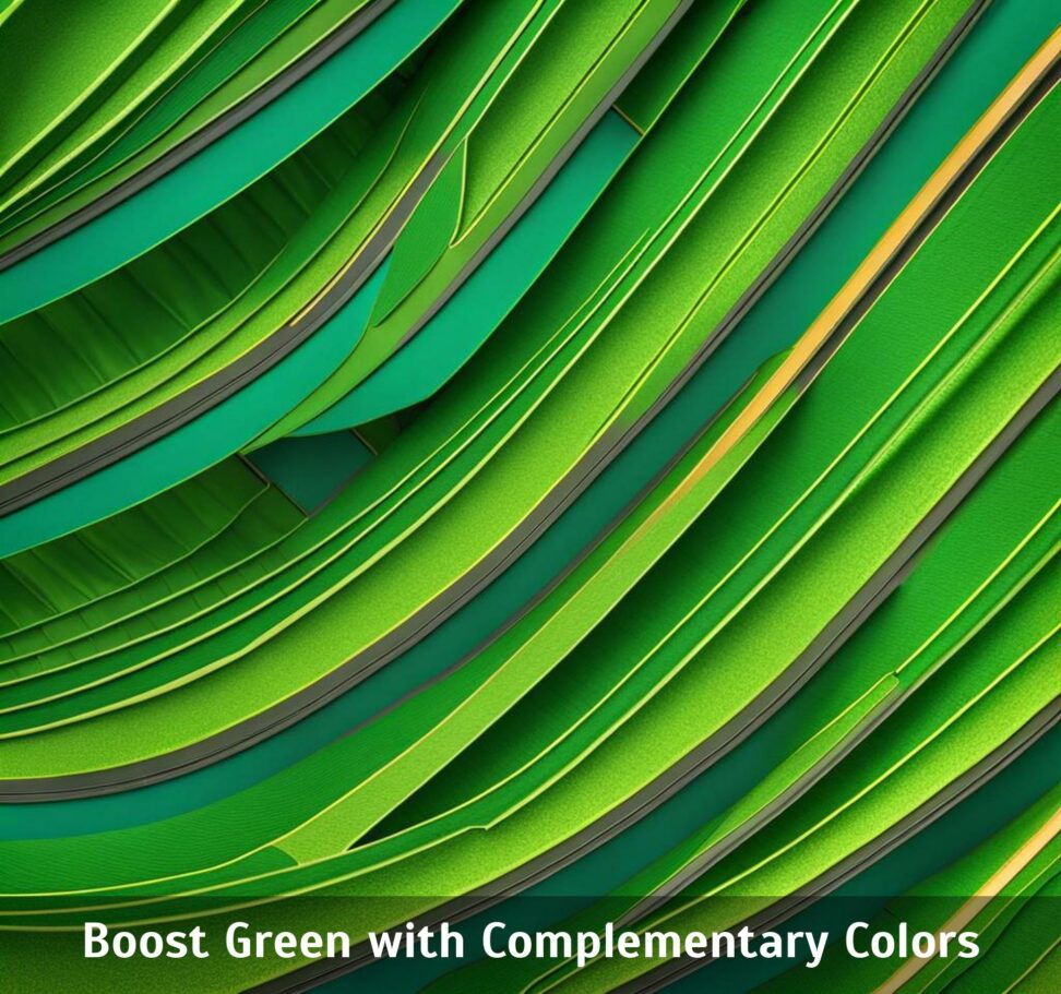
Boost Green with Complementary Colors
Green is a versatile shade that can lend a sense of harmony, growth, and vitality to any space. However, choosing the right complementary colors to pair with different green tones can take an interior scheme or brand image from drab to fab. The judicious use of accent hues that contrast and enhance green's allure are akin to a makeup artist picking the perfect eye shadow to make the iris color "pop." By harnessing the vibrancy of coral, the warmth of gold, or the femininity of blush pink, we can boost green's dynamic appeal.
From olive green's metallic luxury to forest green's rustic coziness, strategic color pairing creates aesthetics that captivate. By the end, you'll have a palette of options to make emerald tones shine beautifully in your next design or decor project.
Olive Green and Gold
Olive green is an earthy, muted shade that brings to mind gnarled tree bark, sagebrush, and mossy forests. As a color, it is subtle yet versatile enough for both masculine and feminine spaces. It also pairs elegantly with metallic gold accents. The mixture of olive green's cool, organic tones with gold's inherent luminosity and luxury creates an atmosphere of refined warmth and sophisticated naturalness.
This color scheme is widely used for upscale interior designs. Olive walls or olive upholstery peppered with golden throw pillows, lamps, frames, vases, or other decor instantly gives a space a "million dollar" flair. These colors also powerfully convey the mood of an Italian villa, Tuscan countryside, or expensive condo thanks to cultural associations.
In branding, olive green and gold together communicate stability, quality, and affluence. Financially savvy companies dealing in wealth management, high-end real estate, crypto assets, or exclusive memberships often leverage this color palette. It tempers excitement with reliability to attract elite and discerning consumers.
Teal Green and Coral
At the other end of the green spectrum lies vibrant teal. With a rich oceanic blue influence, this jewel-toned shade brings to mind tropical lagoons and serene aquatic settings. It has an inherently peaceful quality while still maintaining the vitality inherent to green.
Pairing teal with the warm, cheerful pink-orange hue of coral creates an energetic yet laidback beachy mood. Together they conjure images of sunkissed vacations and tranquil seascapes. This pairing adds cheer and brightness to the calm foundation of green for a balanced, vivacious combo.
In interior design schemes leveraging teal and coral, furnishings featuring teal coupled with coral lamps, rugs, curtains panels and artwork create a delightfully playful look. The mixture of colors and textures provides depth and visual interest while keeping things light and relaxed.
In branding contexts, companies seeking to convey a friendly and casual but reputable image often turn to this tropical color combination. Health spas, eco-resorts, boating outfitters, swimwear lines and more leverage the relaxed positivity these hues emit to appeal to fun-loving and environmentally conscious consumers.
Forest Green and Mustard Yellow
At the darker end lies forest green: a deep, slightly mysterious shade associated with verdant landscapes shadowed by towering evergreens. On its own in large quantities, forest green can feel imposing or gloomy. But when thoughtfully offset with lighter, warmer accent colors, its richness shines.
Pairing forest green with energizing mustard yellow creates the quintessential rustic, traditional mood. Mustard's bright, earthy hue offsets forest green's subdued mystery for a cozy, welcoming look. Together they evoke cabins nestled in pine forests, crackling fireplaces, checkered flannel, and handmade quilts.
In decor, these colors work beautifully on plaid furniture, striped rugs, or patterned wallpaper featuring both shades. The look conjures up images of a charming mountain lodge or quaint bed and breakfast for picturesque getaways. Coupled with natural materials like reclaimed wood, wrought iron, clay and stone, the scheme gains even more down-to-earth appeal.
For branding and packaging, companies in lumber, agriculture, outdoor recreation, and artisanal goods leverage this color duo's inherent traditionalism and connection to nature. It conveys heritage, reliability and conscientiousness for discerning consumers who value quality craftsmanship and responsible sourcing.
Emerald Green and Blush Pink
On the brighter end of green lies emerald: a vibrant jewel tone that conveys growth, renewal and freshness. Its verdant glow has an inherently uplifting quality, like the first tender shoots of spring. Offsetting emerald green's cool vitality with the soft, romantic accent of blush pink creates a playfully feminine scheme brimming with life.
Together these colors capture youthful charm and delicate beauty for a sweet, almost storybook effect. Blush pink softens emerald green's punchy brightness for a more relaxed springtime mood. Accent pillows, floral prints, glass lamps, ceramic vases and embroidered linens in blush beautifully complement emerald walls, upholstery and decorative items.
This lively yet tender color scheme has widespread appeal for lifestyle bloggers, event planners, gardening suppliers, soy candle makers, chocolatiers, boutique hotels and more. It tempers excitement with sentimentality to seize attention and build connection, especially among female audiences.
Mint Green and Plum Purple
Another spring-inspired green worth experimenting with is cool, refreshing mint. With its pale greenish-blue tone, mint evokes invigorating sensations: chilled Mojitos on a sultry day or crisp linen bedding in a seaside cottage. It's a versatile shade lending any space an open, airy quality.
Blending minty coolness with regal plum purple creates a bold yet completely elegant color scheme. Plum's richness provides striking contrast against mint's lightness for visual dynamism. The pairing carries undertones of prosperity and luxury for a refined, fashion-forward aesthetic with timeless appeal.
Within interior decor, plum accent walls, rugs, throw pillows and velvet chairs enrich mint furnishings and ceramic decorative items. Dark wood floors or tables anchor the colors for a polished look. Alternatively, predominantly plum spaces gain levity and brightness from mint lamps, vases, chaise cushions and artwork accents.
For brand imaging, this sophisticated combo attracts high-end clientele with discerning yet progressive tastes. Cosmetics companies, jewelry designers, fashion houses, department stores, art galleries, wineries, or modern furniture brands leverage it to convey exclusivity, innovation and ultimate quality to trendsetting consumers.
Chartreuse Green and Cerulean Blue
On the brightest end of the green rainbow shines chartreuse: an electric, almost neon lime hue humming with energy. In isolation or excess, this shade can feel toxic. But pairing chartreuse green with cool, tranquil cerulean blue creates a compelling dynamic of invigorating contrast.
Cerulean is a rich yet peaceful azure tone bringing immense depth. It shares calming qualities with teal yet boasts brighter intensity. This makes cerulean perfectly equipped to balance vibrant chartreuse without overpowering or muting its glow. Together, the colors exude an electrifying modern mood tempered with centering tranquility.
In progressive living spaces, chartreuse furniture or accent walls energize cerulean sectionals, drapes and area rugs. Alternatively, predominantly cerulean rooms gain modern edge from chartreuse lamps, storage bins, desk chairs and abstract artworks' vivid pops of contrast.
Edgy startups, tech innovators, creative agencies and youth-oriented lifestyle brands harness this punchy yet balanced color scheme in logos, websites and ads. It helps them break through the noise to capture fleeting attention while underscoring progressive dynamism. In moderation, the mix intrigues without overwhelming mainstream consumers.
Complementary colors are green's secret weapon for captivating any audience. Accent shades conveying warmth, cheer, femininity, edge or luxury can intensify different green tones for compelling, camera-ready appeal.
Whether planning a rustic retreat's interior, an elite financial firm's brand image or a boutique candle company's packaging, mindfully counterbalancing green creates aesthetics people instantly connect with. The ability to clarify mood and character through smart color combinations ultimately boosts memorability and marketplace success.
So next time inspiration eludes on an interior or branding project, remember: the right complementary color can make green decor and designs flourish beautifully. With limitless accent options to spotlight emerald shades, the possibilities for dynamism are endless.