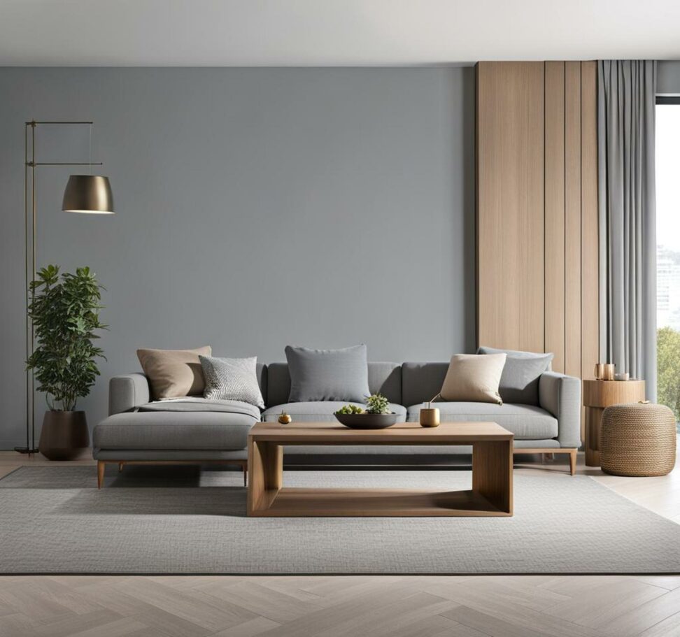
Amp Up Agreeable Gray With Clever Color Combinations
Agreeable Gray by Benjamin Moore has become one of the most popular neutral paint colors in recent years. This versatile gray has undertones of beige, blue, green, and purple which give it a greige quality. The soft and subtle effect of Agreeable Gray makes it an ideal backdrop in any room. Its ability to coordinate with a wide range of styles and colors also contributes to its enduring popularity.
As a graceful neutral that layers well with other colors, Agreeable Gray provides a nice baseline. The gray is light enough to feel airy and bright, but still grounded enough for contrast. This balance and flexibility help explain why Agreeable Gray remains a top paint color choice.
Deciding on Coordinating Color Approach
When using a versatile neutral like Agreeable Gray, you'll first want to decide whether you prefer a mostly neutral color scheme or plan to incorporate bold pops of accent colors. Those opting for a neutral palette might stick to other soothing grays, creamy whites and beiges to create a calm cohesive look. On the other hand, complementing Agreeable Gray with vivid navy blues or spunky greens produces an energetic vibe.

Setting these mood and style intentions early on helps Inform paint choices. Determine if Agreeable Gray will provide a quiet, modest backdrop or interact dynamically with other colors in the space. This decision guides the coordinating color combinations.
Complementary Undertones to Build On
One approach is choosing coordinating colors that play up the existing undertones within Agreeable Gray. As discussed earlier, Agreeable Gray has subtle hints of:
- Beige
- Blue
- Green
- Purple
Strategically pairing Agreeable Gray with colors that flatter these undertones creates a harmonious, complementary balance. For example, a rich navy blue visibly brings out the blue tones while mint green accentuates the subtle green hints.
Soothing, Neutral Color Combinations
To produce a relaxing, neutral color scheme, pair Agreeable Gray with other quiet neutrals like:
- Creamy whites
- Warm grays
- Light taupes
- Other greige colors like Revere Pewter, Edgecomb Gray, or Accessible Beige
This approach highlights Agreeable Gray as a sophisticated neutral foundation for the space. The soothing neutrals almost blend together for a calming, cohesive look not competing for attention.
Make Navy Blue Pop
If opting for more contrast, navy blue is a classic choice that looks gorgeous with Agreeable Gray. Specific shades like Benjamin Moore's Hale Navy or Sherwin Williams Naval provide hit of drama. The rich navy plays up both the blue undertones of Agreeable Gray and aesthetic contrast of light and dark.
Navy gives off a bold yet grounded look against the versatile gray foundation. The color combination feels crisp and elegant while allowing both hues to shine.
Vibrant Green for Spunk
Another way to inject color is embracing a bright, energizing green. Sherwin Williams' Basil green has just enough punchiness to be lively without overwhelming Agreeable Gray. The cheerful green flatters Agreeable Gray's subtle green-blue undertones for a harmonious balance.
Vibrant green gives Agreeable Gray major spunk and personality. This unexpected pairing feels fresh and current. For added flair, extend the color combo to exterior spaces like front doors or outdoor furniture.
More Daring Accent Palette Options
In addition to navy blues and spunky greens, more daring options for accent colors include:
- Mustards
- Light peach tones
- Sage greens
- Brick reds
These bolder shades contrast beautifully with Agreeable Gray's soft neutral background. Mustards and peaches inject warmth and brightness for a cheerful look. Meanwhile, punchy reds and rich emerald greens lend drama and sophistication.
Venturing beyond traditional combinations with bold modern pairings creates personality and flair. The key is balancing richer accents so Agreeable Gray still provides that quiet, versatile baseline.
Finish with Black and White
For the ultimate classic combo with Agreeable Gray, incorporate black and white elements. This high-contrast look with a neutral gray strikes an elegant chord. The trademark palette manages to be interesting yet totally timeless.
Black and white checker patterns, photographs and graphic art give Agreeable Gray a crisp frame. Touches of black and white, especially alongside other colors, allow Agreeable Gray to shine gently in its supporting neutral role grounded by the strongest dark and light extremes.
When determining which colors best complement Agreeable Gray, gather actual paint swatches. Place colors side by side and view together in both natural daylight and warm incandescent light. This allows you to see how the undertones interact in different lighting.
Checking paint color combos directly on the wall is ideal. But paint decks also let you arrange pairings until landing on that winning combination that catches the eye. This designer trick helps narrow the search for Agreeable Gray's color soulmate!